1. Use Pinterest Mood Boards
Pinterest is a great tool to create mood boards. You can collect visual material that you think would be helpful in your project or will provide a direction. These can be images, colors, layouts, existing websites and more.
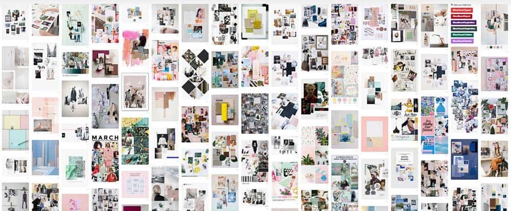
The mood board will act as a central hub for your design inspiration. You are also able to share it with clients or collaborators so they can contribute with their own material.
2. Create a Step-by-Step Plan
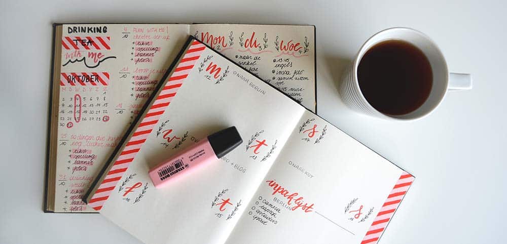 You know what they say: Failing to plan is planning to fail. This is also true in web design. If the website design ideas fail to come around, maybe it’s because you haven’t dealt with the fundamentals yet. Only when the basics are in place, will you be able to put creative touches on top. Here’s what planning can look like:
- Define the website’s goal — You need to know what the site is actually supposed to accomplish. If you don’t, what the hell are you designing towards? Good goals are SMART: Specific, Measurable, Attainable, Relevant and Timely. More on that here.
- Sketch out the buyer’s journey — Besides the overall goal, you also need to figure out what road you want visitors to take. From when they hit your site all the way to whichever objective you have in mind. That way, you can create a structure to guide them along the way. Hubspot has a great article on that.
- Come up with a style guide — Creating a style guide will help you stay consistent in your design. It defines fonts, colors and other design elements. Using one promotes uniformity, especially when working with others. Google is a good example.
- Plan your SEO — Planning is also important for SEO. Create a website map to understand how to structure your information for both visitors and search engines.
3. Focus on the Structure First
Just like making a plan, concentrating on your website’s structure first helps you step away from the process and get more of a bird’s eye view.
It can help to work with a different medium than your computer. For example, by making sketches on paper with a single pen, you can forget about colors and other details for the moment. If you are using flipcharts or a whiteboard, you can even make the whole thing collaborative.
A great exercise can also be to draw the website on a post-it note. This will force you to stick to essentials. A variation of this is to create your design in shades for gray first and only add color later. This way, you are forced to establish a visual hierarchy without relying on color.
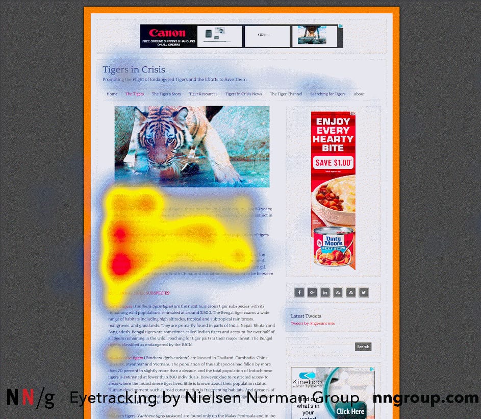
If you are hell-bent on using your computer to design, you can use the “squint test”. That means moving away from the screen and squinting your eyes. The blurred image will show you what is most obvious on your site and what the first-time visitors will most likely notice first.
4. Stick With Web Standards
It’s in the nature of designers to want to be creative. That’s generally a good thing. Keep in mind that it’s necessary to set some boundaries within which to be creative.
For example, in web design, there are a number of established standards. Visitors are used to certain design tropes and website elements. When you break those rules too much, it might confuse them and turn them off.
In fact, Google research has shown that the less a website confirms to prototypical standards, the fewer users perceive it as beautiful. Because of that reason, sticking to established rules is a good idea.
Among those established standards are:
- Consistency in branding and design across all pages
- Website logo in the top left corner
- Contact information in the top right or center
- Main navigation across the top of the screen
- Main headline/value proposition and call-to-action high up on the homepage
- The search feature in the header
- Social media icons in the website footer
I’m sure as an avid Internet user, you are already aware of more standards websites adhere to. If not, you can find more of them here.
5. Focus on Minimalism and CTA buttons
When you know the objective of your site and pages, this also allows you to get rid of everything that doesn’t serve that purpose. This streamlines your design and makes it more pleasant to look at.
Again, there is research to back this up. In the same study mentioned above, Google has found that visual complexity is negatively correlated with website appeal. In short – people don’t want to be overwhelmed! Simplifying your design is good for other features, e.g website speed.
Here are a few things you can safely eliminate:
- Menu items — Of course you want others to explore more of your site. However, an overloaded menu can be super confusing and have negative effects. Again – stick with the essentials!
- Sidebars — More and more websites are phasing out the sidebar. What do you have in your sidebar? Is that really important?
- Muddy jargon — The same thing that goes for stock photos goes for language. Overused phrases, cliches and hollow words make people tune out. Stop using them, inject some personality in your writing, learn some power words and learn copywriting.
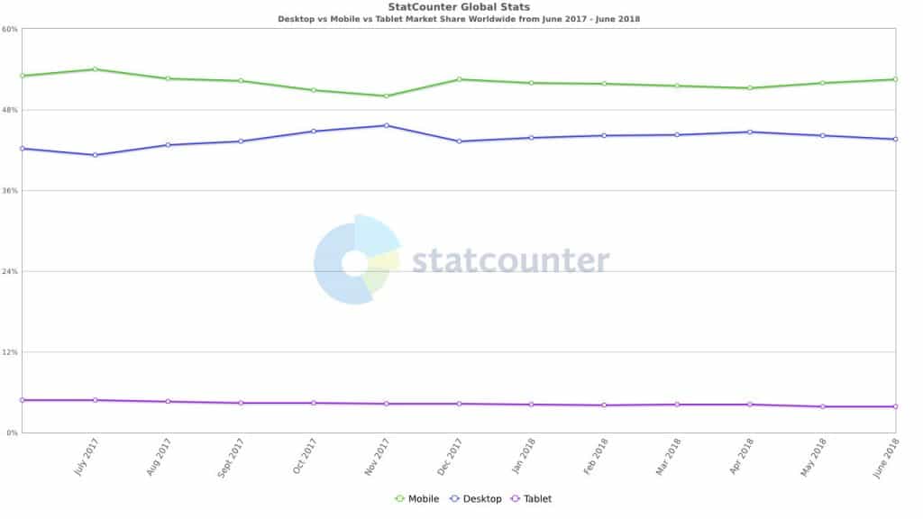
6. Start With Mobile
Mobile devices have taken the world by storm. By now, more people surf the web via phones and tablets than on desktop computers.
Additionally, Google announced that they are rolling out their new mobile-first index. That means, when fully in effect, the search engine will judge every website on their mobile presence first. If it’s not doing its job properly, you will take a hit in the search rankings.
For that reason, when designing a website, it would be a good idea to start with the mobile presence first. From now on, mobile users will be your primary customers. Therefore, you better make sure they feel catered to.
At the same time, it’s good practice for coming up with website design ideas. Again, starting with mobile forces you to concentrate on the essentials and think through the purpose of your design. You can then further unfold and add elements as the screen size grows bigger.
7. Pay Attention to Content Formatting
Content formatting is an underestimated tool for web designers. Content is the most important element of your site, be it in the form of blog posts or a sales copy. In the end, that is what you want visitors to consume. Your design’s purpose is to present it in a way that they do.
Unfortunately, by now people are so saturated that few of them read everything on your page. Instead, most visitors scan. Furthermore, they tend to do so in an F-shaped pattern.
It means that you need to make your content fit their consumption habits to make it more impactful.
Here’s how to do that:
- Include headings — Headings are a great way to break up content. Many readers also use them as anchor points for scanning and read only those parts under headings that seem interesting to them. Therefore, make sure to use headings and make them descriptive.
- Use paragraphs and lists — Nobody wants to read one large blob of text. Paragraphs divide content into little chunks. Open up a new one whenever you open up a new point. Lists have a similar function and make information more accessible. Use them as well.
- Don’t skimp on media and visuals — Visual information is much more approachable for the human brain than text. For that reason, it’s a good idea to use images and other media to underline the points made in your copy. It’s also, again, a great way to break up longer pieces of text.
- Optimize your fonts — Your use of fonts also greatly influence legibility. The most important tools you have here are the size and line height. Go for at least 16px (Medium has 22px!) and make sure to add more line height the smaller the font you are using.
If you investigate this article, you can see all of the above in effect.
8. Try Out One-Page Design
Back in the day, website design was all about the fold. Everything important had to be above the limit from which users would start scrolling. There’s still something to be said about it since that’s still where users spend most of their time.
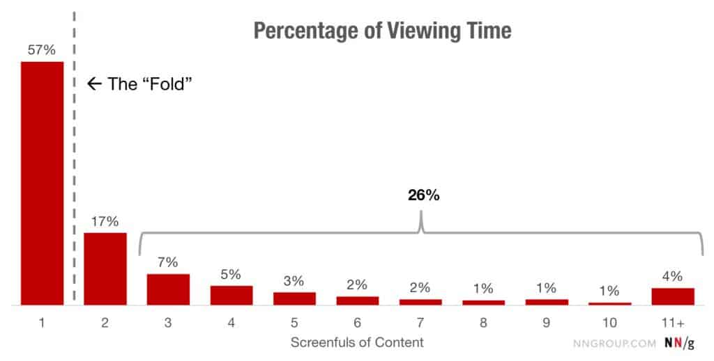
That doesn’t mean that the fold is the be-all and end-all of your page. People will indeed scroll. In fact, they will scroll down your whole page if you give them a reason to.
Crazy Egg tried this out when they replaced their original sales page with a 20 times longer one.
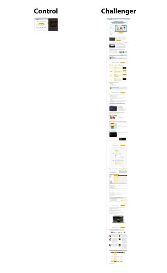
The result: the conversion rate went up by 30 percent! If your current buyer’s journey goes across several pages, consider consolidating them all into one place instead. This might be one of those website design ideas that makes all the difference.
Don’t bury content in slideshows/carousels or tabs/accordions, they don’t work!
9. Employ A/B Testing
Sometimes when evaluating different website design ideas, it can be hard to decide which is the right way to go. You think back and forth, make tweaks, yet stay unsure of your decision. At some point, thinking will no longer cut it. You will have to let users decide.
A/B testing can be a great way to see what makes your website better. It means serving different versions of your design up to visitors at random, then check how they are reacting. You can make decisions based on the results.
You can test pretty much anything. From entire page designs over color changes, calls to action to images, article titles and fonts. All of these can make a huge difference in the performance of a page. Yet, if you don’t test it, you’ll never know!
These tools and plugins will help you in doing the tests.
